
Did you know a single color can change global design trends for a year? Since 2000, Pantone’s Color of the Year has influenced everything from fashion to interior design. It impacts over $1 trillion in spending every year. The Pantone Color of the Year is a big deal. Designers, marketers, and trend forecasters all look forward to it. It shows what’s happening in our culture and guides future designs. Pantone started as a tool for the printing industry. Now, it’s a leader in color trends. The Color of the Year has been key in making Pantone a trendsetter in design.
For us exploring architecture psychology, the Pantone Color of the Year is especially fascinating. Color isn’t just about aesthetics, it profoundly impacts how we feel, think, and behave in spaces. By understanding the psychology behind these carefully chosen hues, we can better design environments that inspire, comfort, or energize the people who inhabit them.
Key takeaways:
- Pantone’s Color of the Year influences over $1 trillion in consumer spending
- The annual color selection reflects global cultural trends
- Pantone evolved from a printing industry tool to a design trendsetter
- The Color of the Year impacts multiple industries, including fashion and interior design
- This initiative has solidified Pantone’s role as a color authority
The origins of Pantone and color standardization
The story of Pantone starts with Lawrence Herbert. In the 1960s, he saw a big need for a color system in printing. This need sparked a color revolution that changed design forever. Lawrence Herbert bought Pantone in 1962. He wanted to fix the color chaos in printing. His dream was to create a color language everyone could understand. Herbert’s system began with 10 colors. It quickly grew as designers and printers loved its simplicity and accuracy. Each color got a number, making it easy to match shades everywhere.
Birth of the Pantone Color Institute
As Pantone’s influence grew, so did its goals. The Pantone Color Institute was created to study color trends. It became a leader in color forecasting, affecting fashion and product design.
Now, the Pantone color system has thousands of colors. It’s the top choice for designers worldwide, ensuring colors match across materials and platforms. The Pantone Color Institute keeps shaping color trends, making it a global design leader.
Pantone Color of the Year history. From inception to present
The Pantone Color of the Year tradition started in 2000. It marked a big change in color trends. The first color, Cerulean Blue, showed the new millennium’s hope and calm.
Every year, Pantone picks a color that shows the world’s mood. The color often reflects what society feels and thinks. For instance, in 2009, Mimosa yellow stood for hope when times were tough. In 2013, Emerald green meant growth and new beginnings. Now, we’re getting close to the 25th anniversary of the Pantone Color of the Year. It’s amazing to see how it has grown. At first, colors were simple, but now they’re more complex. In 2016, Pantone chose two colors: Rose Quartz and Serenity. They stood for embracing all kinds of people and moving forward together.
| Year | Color | Symbolism |
|---|---|---|
| 2000 | Cerulean Blue | Millennium’s hope |
| 2009 | Mimosa | Optimism in uncertainty |
| 2013 | Emerald | Growth and renewal |
| 2016 | Rose Quartz & Serenity | Gender fluidity |
The selection process. How Pantone chooses the color of the year
Pantone’s Color of the Year selection is a detailed process. It involves a lot of research and expert analysis. The chosen color shows global trends and cultural influences, making it a big deal in the design world.
The role of expert Color Committee
A group of color experts get together to talk about and argue over colors. This team includes designers, marketers, and other industry pros. Their different views help pick a color that’s both current and forward-thinking.
| Selection Stage | Key Activities | Duration |
|---|---|---|
| Research | Global trend analysis, cultural studies | 6-9 months |
| Committee Review | Expert discussions, color shortlisting | 2-3 months |
| Final Decision | Color selection, contextual analysis | 1 month |
Milestone colors. Most influential picks through the decades
Pantone’s Color of the Year has made a big impact on design trends. Let’s look at some key picks that have changed how we see things.
- In the early 2000s, Turquoise became a big hit. It brought a fresh and calming vibe to designs. This color reminded us of the sky and sea, making us dream of tropical places.
- Then, in the 2010s, Ultra Violet made a bold move. This deep purple color stood for new ideas and creativity. It encouraged designers to explore new color options.
- Living Coral was all the rage in 2019. It’s a warm color that made us feel happy and optimistic. It showed up in fashion, home decor, and graphics, bringing joy to our digital lives.
- Recently, Viva Magenta became a hit. It’s a bold pink-red color that shows our need for self-expression. It’s all about being creative and strong after the pandemic.
These colors have not just followed trends but have also shaped design in many fields. Their influence is still felt, guiding creative choices and what people like around the world.
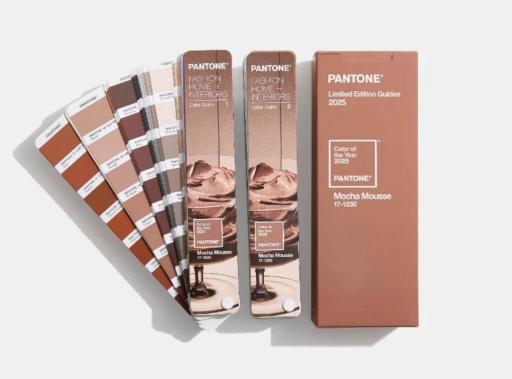
2024’s Peach Fuzz to 2025’s Mocha Mousse
Pantone’s Color of the Year picks always excite the design world. Moving from 2024’s Peach Fuzz to 2025’s Mocha Mousse shows a change in color trends and what people feel.
Peach Fuzz, with its soft, warm undertones, embodied a sense of optimism and playfulness, reflecting the desire for comfort and joy in an increasingly complex world. It resonated with those seeking a lighthearted escape, a celebration of life’s simple pleasures.
In contrast, Mocha Mousse introduces a deeper, richer palette that suggests sophistication and grounding. This shift may signal a collective yearning for stability and warmth as we navigate through uncertain times. The earthy tones of Mocha Mousse evoke feelings of introspection and resilience, inviting designers and consumers alike to explore themes of authenticity and connection.
As we look forward to 2025, we can expect to see Mocha Mousse influencing a wide range of design elements, from fashion and home decor to graphic design and branding. Its versatility allows it to blend harmoniously with both muted and vibrant shades, creating a canvas for creativity that encourages depth and exploration.
Moreover, this transition may inspire innovative combinations with complementary colors, leading to fresh palettes that reflect the evolving tastes of society. By embracing Mocha Mousse, designers can tap into the narrative of comfort and strength, using this rich hue to create spaces and products that foster a sense of belonging and warmth.
The story behind Peach Fuzz
Peach Fuzz, the 2024 Color of the Year, is all about warmth and softness. It shows our wish for comfort and connection when things are uncertain. Designers used Peach Fuzz in fashion, home decor, and digital media to make spaces feel soothing and welcoming.
Mocha mousse. A new direction
In 2025, Pantone 17-1230 Mocha Mousse is the star. This deep, earthy color means a move towards feeling grounded and stable. Mocha Mousse, the 2025 color of the year, is inspired by nature. It makes us feel comfortable and luxurious.
| Year | Color | Mood | Key Applications |
|---|---|---|---|
| 2024 | Peach Fuzz | Soft, comforting | Fashion, interiors, digital design |
| 2025 | Mocha Mousse | Grounding, luxurious | Furniture, textiles, packaging |
Industry impact. From fashion to interior design
Pantone’s Color of the Year has a big impact on many fields. It shapes fashion trends and home decor. Fashion designers look forward to the announcement to add the color to their collections. This color then spreads to stores, affecting what people buy. It influences clothes and accessories.
In home design, the Color of the Year brings new ideas. Paint companies make matching colors, and furniture makers create pieces in the trend color. People and designers use it for decorating, from walls to pillows.
The effect also reaches product design. Makers release items in the year’s color. This includes kitchen stuff and tech gadgets, helping people stay trendy in all areas of life.
| Industry | Impact of Color of the Year |
|---|---|
| Fashion | Influences seasonal collections, fabric choices, and accessories |
| Interior Design | Inspires room color schemes, furnishing selections, and decor items |
| Product Design | Guides color choices for appliances, electronics, and everyday items |
| Graphic Design | Shapes branding, packaging, and marketing materials |
Digital age. How Pantone colors influence web and graphic design
Pantone colors shape the digital world, influencing web design and graphic arts. As new technologies emerge, designers adapt to use these hues across platforms.
Digital color implementation
Web designers embrace Pantone’s yearly color pick in their projects. They use it for buttons, backgrounds, and accents. This keeps websites fresh and on-trend. Graphic designers also apply the color to logos and marketing materials.
Cross-platform color consistency
Keeping colors consistent across devices is key. Designers use digital standards to ensure Pantone colors look the same on phones, tablets, and computers. This helps brands maintain their identity online.
Adobe integration and digital standards
Adobe software plays a big role in using Pantone colors digitally. Programs like Photoshop and Illustrator include Pantone libraries. This makes it easy for designers to pick and use these colors in their work.
| Platform | Color Implementation | Consistency Challenge |
|---|---|---|
| Websites | CSS color codes | Browser differences |
| Mobile Apps | Native color systems | Screen type variations |
| Print Media | CMYK values | Digital to print matching |
As digital standards evolve, designers must stay updated. They learn new ways to use Pantone colors in their digital creations. This keeps their work modern and appealing to viewers.
Color psychology and cultural impact
Colors talk to us all, stirring feelings and changing how we see things. The Pantone Color of the Year is a big part of this, guiding trends and showing what’s on our minds.
Emotional responses to color choices
Colors can make us feel calm or full of joy. Blue makes us relax, while yellow makes us happy. Pantone picks colors that show how we’re all feeling, in a way we can see.
Societal reflections in color selection
Every year, Pantone picks a color that shows what’s happening in our world. When times are tough, they choose colors that make us feel hopeful. When things are going well, they pick bright, bold colors that show our confidence and happiness.
Natural elements and sustainability in color selection
The world of color is turning green. Pantone’s choices now reflect a growing interest in the natural world. This shift brings earthy tones and eco-friendly hues to the forefront of design.
Eco-friendly color influences
Nature’s palette inspires today’s color trends. Soft greens, warm browns, and muted blues mimic the natural elements around us. These colors bring a sense of calm and connection to our spaces. Designers use these earthy shades to create sustainable looks. They pair well with recycled materials and energy-efficient lighting. The result? Spaces that feel both modern and timeless.
Biophilic design connection
Biophilic design brings the outdoors in. It uses natural elements to improve our well-being. Color plays a key role in this approach. Pantone’s recent picks often align with biophilic principles.
| Natural Element | Color Influence | Biophilic Benefit |
|---|---|---|
| Forest | Deep Greens | Stress Reduction |
| Ocean | Blues and Teals | Calmness |
| Sunlight | Warm Yellows | Energy Boost |
| Earth | Rich Browns | Grounding |
These nature-inspired colors do more than look good. They help create spaces that feel alive and nurturing. As we face environmental challenges, expect to see more colors that celebrate and protect our natural world.
Future trends and color forecasting
Color forecasting is a mix of creative vision and data analysis. Pantone’s experts are already planning color trends for the future. These predictions are based on global trends, new tech, and social changes. Looking ahead, colors inspired by new tech might become popular. With virtual and augmented realities growing, we could see more digital colors. These might be bright, perfect for screens and real life. Sustainability will also shape future colors. Nature-inspired colors like soft greens and earthy browns will likely be in style. These colors reflect our growing love for the environment.
Pantone also looks at global events and cultural shifts. Colors that stand for unity, hope, and strength might be big in the future. We might see warm colors and bold ones that inspire us to act. The future will mix tech and nature in colors. This could lead to new, exciting color combinations. These might challenge old color rules and bring fresh looks to our world. 2026 (Prediction) Forest Green Natural, revitalizing Eco-friendly products, outdoor gear, wellness spaces
Conclusion
The Pantone Color of the Year has made a big impact on design and culture. For the last 20 years, it has set trends and inspired creativity in many fields. It has influenced everything from fashion to home decor, sparking new ideas and guiding designers everywhere. The history of the color of the year shows how tastes and values have changed. Each color chosen tells us about the era it was picked in. These colors help artists and brands connect with people in a meaningful way.
Looking ahead, the Pantone Color of the Year remains important. It influences more than just how things look, touching on big issues like the environment and diversity. This event is eagerly awaited, shaping our visual world and inspiring many creative minds globally.
FAQ
Q: What fun facts do you know about Pantone’s Color of the Year?
A: Yes, there are some interesting fun facts about Pantone’s Color of the Year:
- After Greenery was selected in 2017, food trends leaned into matcha lattes and avocado everything, not just for health, but for aesthetics.
- There is a Pantone Cafe located in Monaco, it serves food and drinks in colors matched to Pantone swatches. Want a latte in Pantone 19-4052 Classic Blue? No problem!
- In honor of Living Coral, an ice-cream shop created a coral-colored sherbet. Flavor – mix of peach, mango and raspberry.
- Pantone colors were used to help design spacesuits and NASA’s branding. Pantone’s influence has literally gone beyond Earth.
- The Pantone Hotel in Brussels dedicated an entire suite to the Color of the Year – Ultra Violet in 2018. From the bedding to curtains, it was an immersive purple experience.
- Several Color of the Year selections, like Living Coral (2019) and Very Peri (2022), were transformed into nail polish shades, often selling out within days.
- When Rose Quartz and Serenity were chosen as 2016’s Color of the Year, they inspired limited-edition perfume.
- A study has shown that 85% of shoppers base purchase decisions on color. Aligning with the Color of the Year can boost a product’s appeal.
Q: How might Mocha Mousse impact design and fashion in 2025?
A: Mocha Mousse is likely to influence various design fields, from fashion and interior design to graphic design and product packaging. Its versatile nature as both a neutral and a statement color might lead to its incorporation in a wide range of products and designs, potentially paired with both muted and vibrant accents.
Q: How does the 2025 Color of the Year reflect current global trends?
A: Mocha Mousse reflects a global desire for comfort and luxury in challenging times. Its earthy tone connects with sustainability trends, while its rich, indulgent quality speaks to a collective yearning for small pleasures and moments of serenity in our fast-paced world.
Q: How can designers and brands incorporate Mocha Mousse into their 2025 palette?
A: Designers and brands can use Mocha Mousse as a sophisticated neutral base in their 2025 color palette. It pairs well with a range of colors, from soft pastels to rich jewel tones. The versatile shade can be used in various applications, from textiles and packaging to digital design and branding elements. For 2025, Pantone has chosen Mocha Mousse (Pantone 17-1230). This color is a warm, rich brown. It brings a feeling of comfort and connection to nature.
Q: What was the first Pantone Color of the Year?
The first Pantone Color of the Year was in 2000. It started Pantone’s annual color forecasting. This event is now eagerly awaited in the design world.